savr recipes
Mobile UX/UI Design Sprint
This was a modified GV design sprint. I was provided with research material and given objectives. I self conducted the analysis, design process, and usability testing.
context
This project was a week-long, modified GV design sprint. Savr is presented as a startup that strives to make it easier to follow recipes and cook great meals at home. I received research materials and was assigned with the task of designing a red route based on the user’s needs.
problem space
Savr has recently seen some negative reviews about recipes that involve many steps or more advanced techniques. Users enjoy finding the recipes and the quality of the recipes; however, there needs to be improvement when it is time for the user to prepare a dish.
Solution
I adapted an evaluative approach to solve the problem. I analyzed the research provided, sketched some solutions and created prototypes. I then underwent usability testing in order to iterate on the prototype.
Provided research & artifacts
I was provided with reviews, an audio recording of an interview, and a persona. From this I compiled a list of user frustrations.
User Frustrations
Not knowing all the kitchenware that will be needed
Having to touch and use their phone often to follow the recipe
Not knowing if they’re on the right track
Having to research complex techniques
Steps or timing being out of order
Unfamiliar ingredients
insights
Users want each step to be time efficient
Users want to know the materials before starting
Users want reassurance that they are doing the right thing
Users dislike researching complicated techniques
Users dislike touching their phone often while cooking
industry inspiration
I chose the apps of Umami, Kitchen Stories, and BBC Good Food for inspiration because they provide step by step processes, videos and/or pictures of how each step should appear, a list of the ingredients and estimated times.
Umami has an interactive checklist so users can check off each ingredient/utensil before preparing a recipe. Kitchen Stories shows the number of steps along the bottom of the recipe and a picture at the top that shows the user what each step should look like. BBC Good Food has a cook mode that keeps users’ phone screens on so they don’t have to keep unlocking and touching their phones. It also has an Alexa mode so users don’t have to touch their phone screens with dirty hands.
research synthesis
User Frustrations
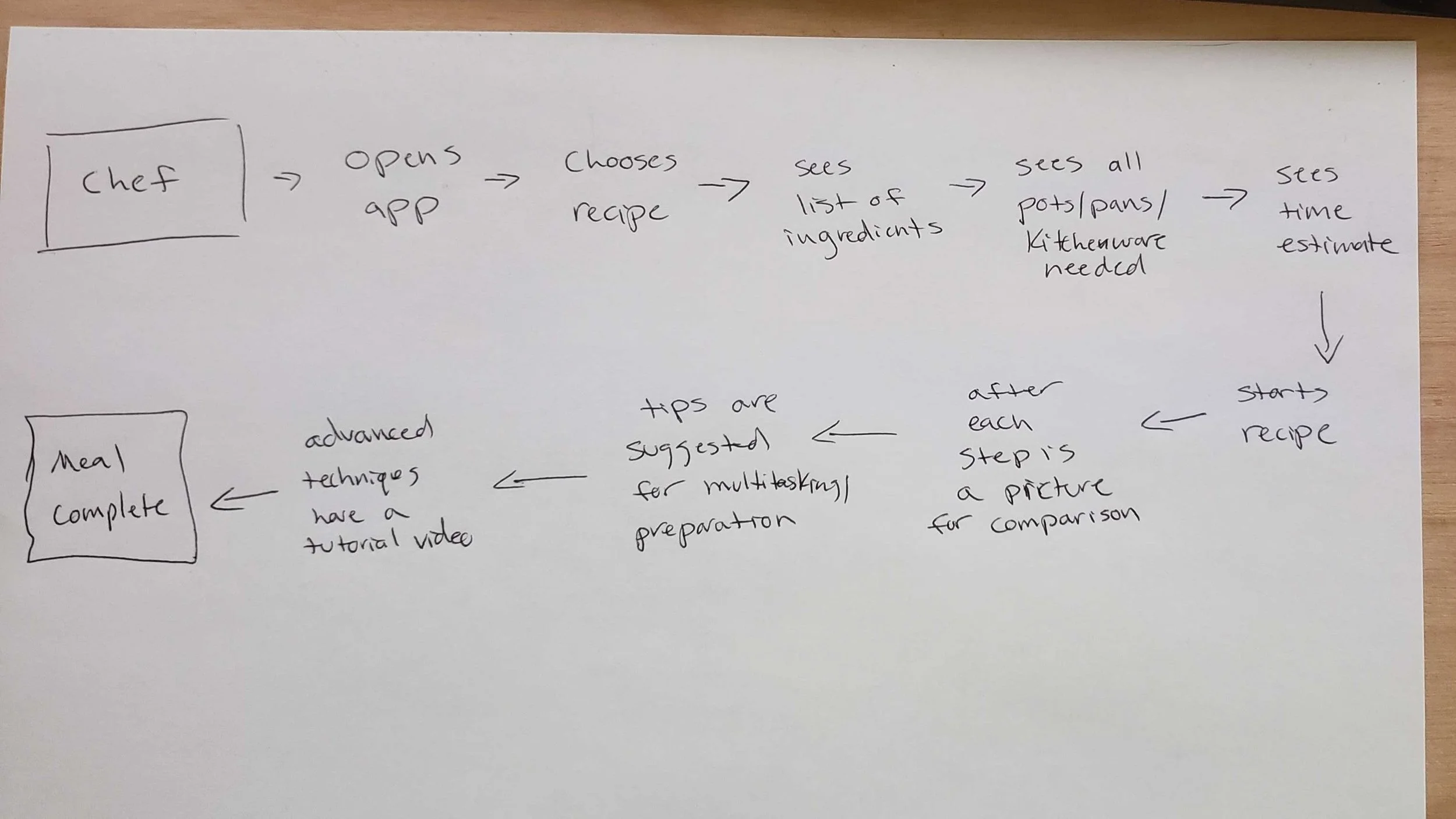
For my map, I chose the red route of following the directions while preparing a recipe because users have the most difficulty in this section.
Crazy 8’s
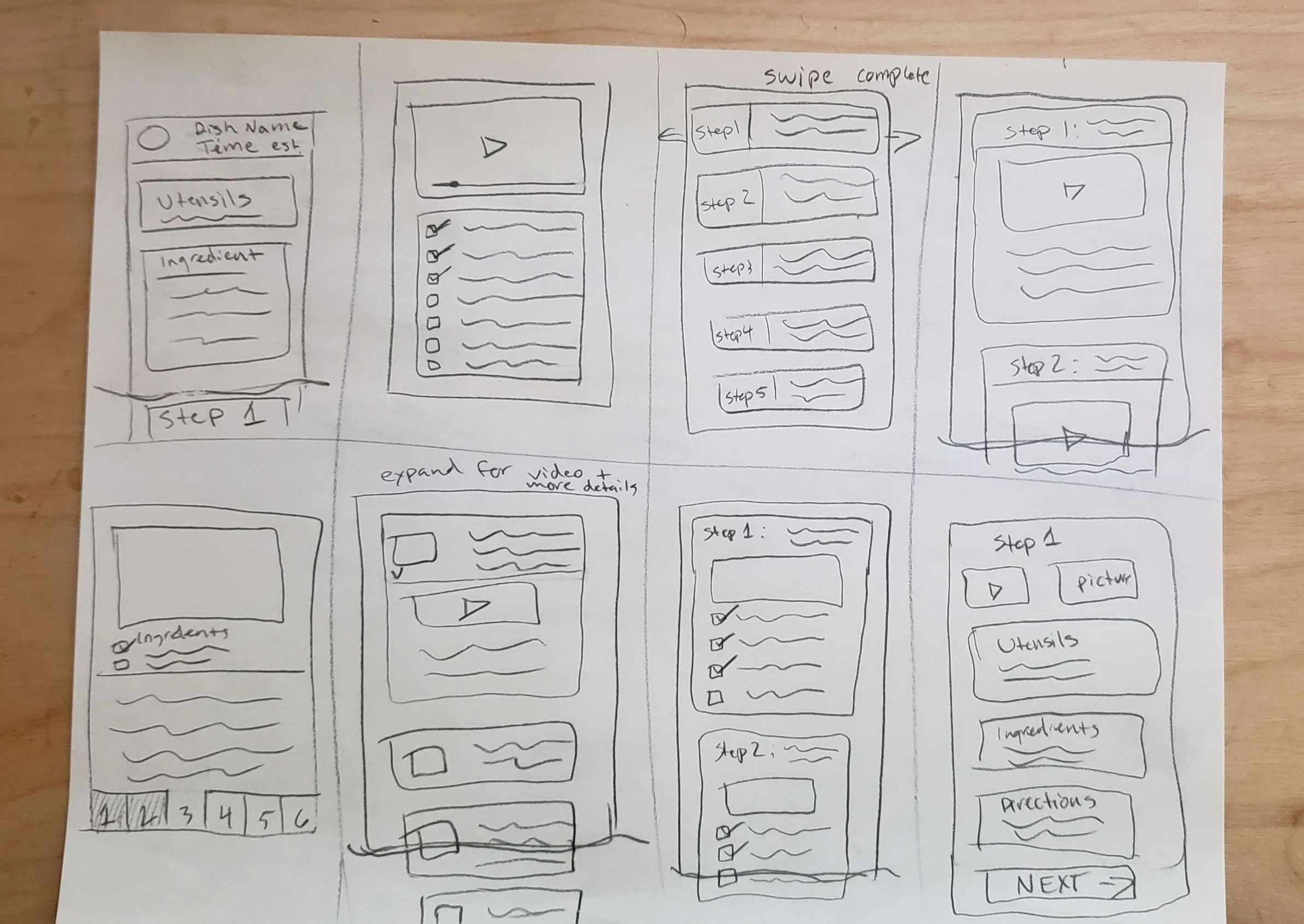
For this exercise I brainstormed screen ideas. I chose the 5th sketch (bottom left) because it provides the essentials while remaining minimalist.
Solution Sketch & Storyboard
For my solution sketch, I sketched the before and after screens along with my critical screen. For the storyboard (the actions a user takes to complete the red route) I sketched two more screens to add to the flow. This totaled 5 screens: the home page, the summary page, two cooking pages, and the finished page.
First Prototype, a Realistic Façade
After sketching, I created a realistic façade for my first prototype. These screens are not as low fidelity as a wireframe, but in adding color and details I was more prepared for thorough usability testing.
usability testing
Main Issues:
The time estimate on each recipe with the pink background was hard to read
Not knowing what the Cook Mode and Voice Mode buttons at the top of the screen actually do
The main red color is a little too harsh and often associated with errors and the watch video had too sharp of corners
Iterations to Solve Issues:
Changed the time estimate to be glassmorphism style with a white blurred background to make it more easily readable
Added clickable information buttons to Voice Mode and Cook Mode to help explain what they do
Softened the main red color to be more salmon and also rounded the corners of some components to match the overall design
Final Design
Conclusion
My final screens solve the original frustrations in a simple, subtle manner. Users had most of their frustrations when it became time to prepare a recipe. Within the app, users can now research complicated techniques using the video tutorials, and they can be reassured they are doing the right thing by referring to the images with each step. Users no longer have to worry about touching their phones with dirty hands or constantly having to turn their screens back on with Voice Mode and Cook Mode. They also can look ahead at the steps along the bottom of the recipe to reduce time and errors. Between initial user testing and the final iterations, time-on task to complete a recipe decreased 40%. Lastly, users can use the interactive checklist before starting and with each step to make sure they have all the utensils and ingredients ahead of time. These final screens are more minimalistic, modern, and aesthetic. 100% of users found that the cooking process was easier to use with the added features and improved designs. Users of Savr Recipes can now enjoy all aspects of the app without frustrations when it comes time to cook!


