Problem
Most people know that exercise helps with long-term health and happiness; however, there is still a problem with people not exercising or struggling with motivation. 1 in 4 people are physically inactive worldwide, and 71% of beginners stop working out within the first 3 months of starting a program. There are many pain points with working out, such as lack of motivation and lack of support from friends and family. My objective was to find solutions to improve the workout experience and provide motivation and engagement with exercise.
of Americans failed to meet the recommendation of 2 strength workouts per week
69.8%
workouts per week were associated with fewer mental health concerns
3 to 5
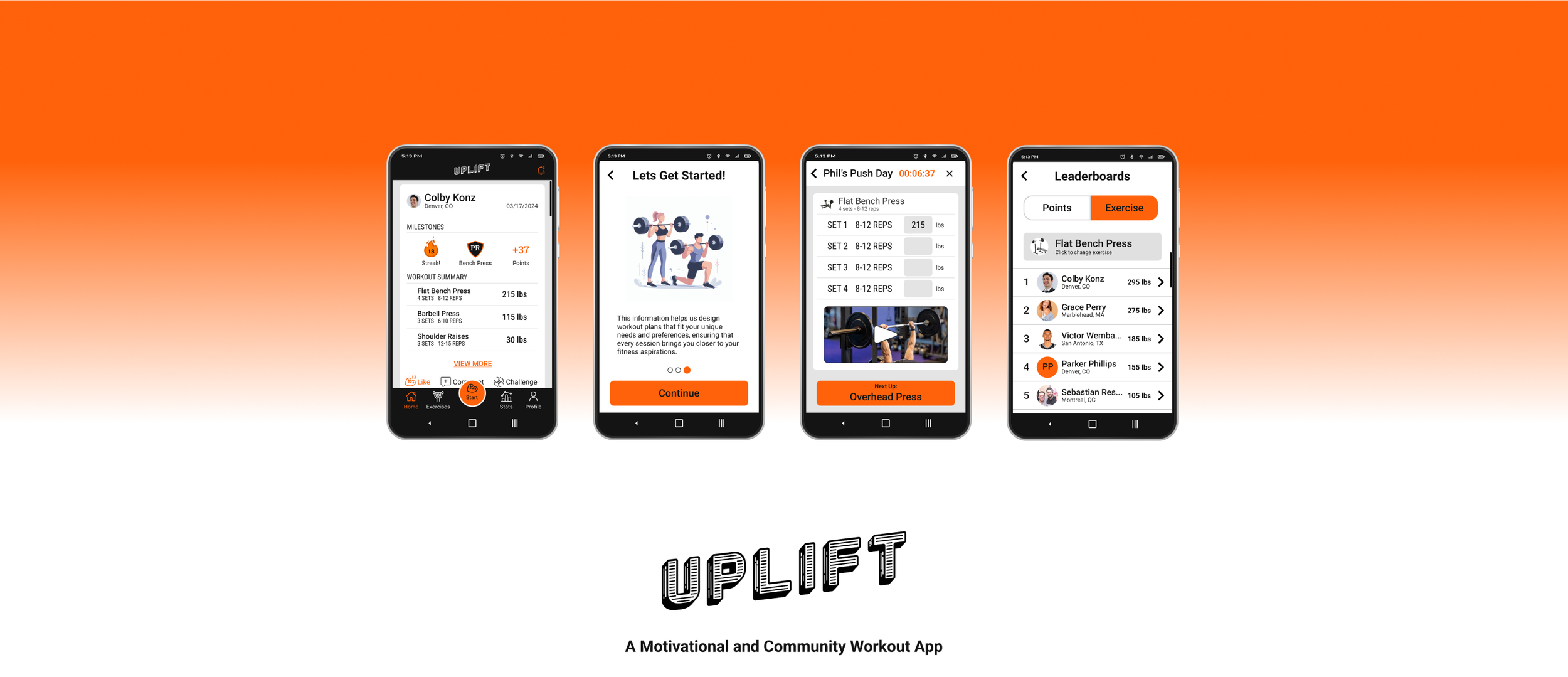
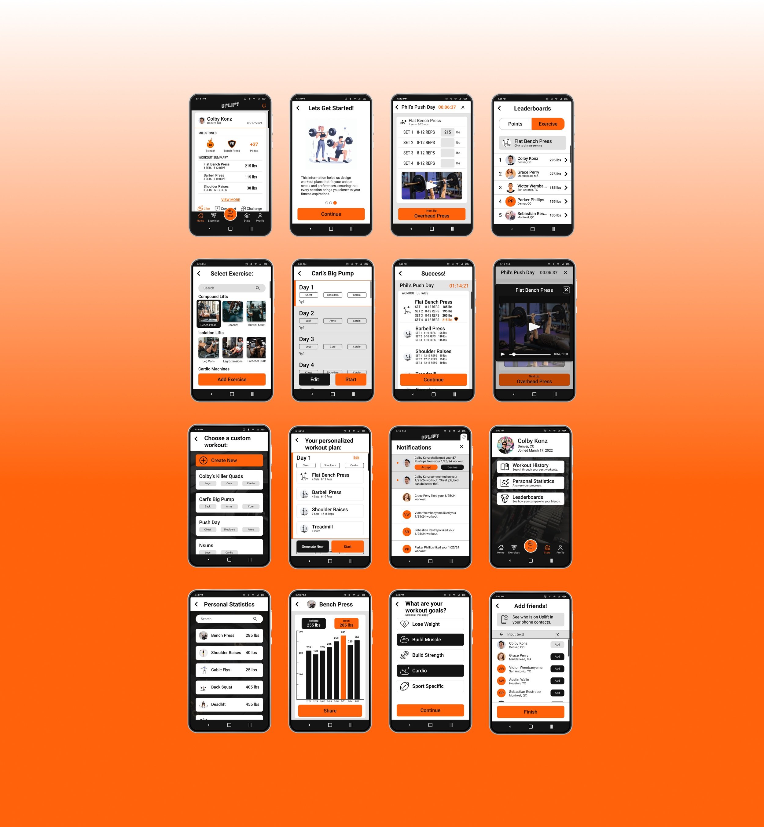
Through extensive UX Research & Analysis, my solution was to create an easy-to-use workout app to help provide motivation, build a community, and include workout tools. This new app “Uplift” allows users to create custom workouts or use AI-personalized workouts generated by the app. They will be able to see an activity feed of other users they added as friends so they can keep each other accountable and support each other after each workout. Users will also be able to track workout stats and see their improvement over time. These features will help users be more motivated to exercise and help build a community of like-minded users.
solution
My Role
I was the project lead and sole designer in charge of UX research, UX design, and UI design. Uplift is a majority of my effort along with feedback and advice from my mentor Johnny Ceron.
tools
Figma
Miro
Adobe Photoshop
Step 1: Secondary and User Research
I kicked off by establishing my research goal and focusing my efforts on secondary research, competitive analysis, and user interviews.
Research Goal
I wanted to identify the major pain points of working out and the main audiences that struggle with them. I also wanted to find potential solutions that could help mitigate or prevent these pain points.
secondary research
The main audiences that struggle with exercise are women, beginners, and those in economically disadvantaged communities.
The main factors causing people to struggle with working out are:
lack of time
friends & family don’t share the interest
lack of motivation/energy/confidence
lack of knowledge
lack of resources/equipment
lack of childcare
According to the American Council on Exercise, some ways to motivate people to get fit are: to make fitness fun, make workouts short and sweet, have a workout partner, extol the benefits, and don’t lecture or nag. These aspects must be combined into a cohesive program that will motivate and inspire the users.
competitive research
There are several common issues with the currently available solutions.
Most fitness apps don't use proven motivational techniques. Most apps focus more on teaching a user how to exercise without providing any motivational support. There's little incentive for app developers to use behavioral science, because their metric for success is downloads, not how often you exercise or if you're making progress toward your goal. Most marketers don't wait for the science before they sell. There's opportunity to improve in this area.
There is a lack of automation for fitness apps. Most fitness apps ask users to log everything they eat each day. Fitness apps suffer from a lack of automation features that allow users to input all required information more quickly. It’s hard to imagine users spending time logging their food every single day for an extended period of time. That’s why many users abandon these apps after a month or two. They simply run out of patience.
There also tends to be a lack of community support. Lack of community support from friends or family is a severe disadvantage when it comes to lifestyle changes such as adopting a healthier diet or getting more exercise. Fitness apps still fail to provide users with active communities of people who are just as motivated.
Interviews
To gain additional insight, I proceeded with user interviews.
I interviewed five participants with different levels of workout experience who want to improve.
I asked 27 open-ended questions and several follow-up questions.
Two participants used a workout app while the other three hadn’t found an app that they liked enough to keep using and so used their own custom spreadsheets.
Sample Questions:
If you could make the perfect workout app, what would it do for you?
Can you describe any challenges you have with working out?
How do you stay motivated to workout?
Tell me about a particular time you struggled with working out and ended up overcoming any obstacles.
“I would love a community where I could share my progress and track my friends’ progress as well. It would help with my motivation and accountability.”
Interview Participant Quote
Step 2: Synthesizing Results
I used several analyzation techniques to synthesize the information I had gathered during the research phase. First, I created an affinity map with information gathered from the user interviews, and then created two personas, several “How Might We” problem statements and user stories.
Affinity Map
5/5 participants said they would prefer to be part of a community for several reasons:
to push themselves harder when they are competing
to be able to ask questions or advice
to enjoy the social aspect
5/5 participants had previously used some form of workout app, however only 2/5 currently used one.
Various frustrations for different participants caused struggles with working out: i.e. lack of time, tiredness in the evenings, motivation, sore muscles, and more.
4/5 participants would be interested in tracking their data and metrics
4/5 participants struggled with self-motivation
3/5 participants would be interested in a nutritional aspect within a workout app
Personas
The participants I interviewed fell into one of two categories: casual exercisers or serious athletes. I created two realistic representation of a potential app’s key audience and called them Gym Rat Steve and Casual Caroline. Having the personas helped me stay focused on the user’s needs throughout the design process. I observed the user’s behavior during user interviews to collect data which enabled me to think from the user’s perspective. You can see the two Personas below.
“how might we…” Statements
To devise solutions that specifically address the frustrations of casual and serious athletes, I formulated “How Might We” questions:
How might we help motivate people to work out regularly?
How might we create a community of people who workout regularly?
How might we make users feel confident at the gym and in their knowledge of working out?
How might we create an easy way for users to find and follow a workout plan/routine?
How might we help users build and create their own customized workouts?
user stories
Writing user stories helped guide me toward the production process. My complicated thoughts became evident thanks to the simplified breakdowns of users’ potential needs. This allowed me to narrow down which features I would include in the Minimum Viable Product (MVP).
Step 3: Mapping Information Architecture
I used the information from the user stories to decide on the Minimum Viable Product (MVP), create a site map and create user flows.
Sitemap
Creating the sitemap gave me a visual representation that let me keep track of all the different screens within my app and visualize how they are all connected. I used the information from my user stories, user interviews, and secondary research to decide exactly which screens will to include in my MVP.
User Flows
In Miro, I created three user flows for the three major red routes that will be included in the MVP.
User Flow 1: Onboarding
Scenario 1: an existing user accidentally deleted the app and would like to log back in after reinstalling.
Scenario 2: a first time user wants to register and setup up their profile.
User Flow 2: Workout
Scenario 1: a user wants to start a workout using a personalized workout that was created with our AI tool based on their stats and goals.
Scenario 2: a user wants to start a workout using a custom-made workout or a workout shared with them from the community.
Scenario 3: a user wants to custom build their own workout.
User Flow 3: Statistics
Scenario 1: a user wants to check their past workouts.
Scenario 2: a user wants to check their statistics and analyze their progress over time.
Scenario 3: a user wants to check the leaderboards and see how they compare with their friends.
Step 4: Ideating the first concepts
Now the fun part begins. With all the supporting data presented, I started to create iterations of hand-drawn sketches before diving into wireframing and prototyping. I asked myself: “What’s the best way to communicate the thoughts?”. These hand-drawn sketches are helpful to keep me from getting too detailed on the visuals.
Hand drawn wireframes
Low-Fidelity wireframes
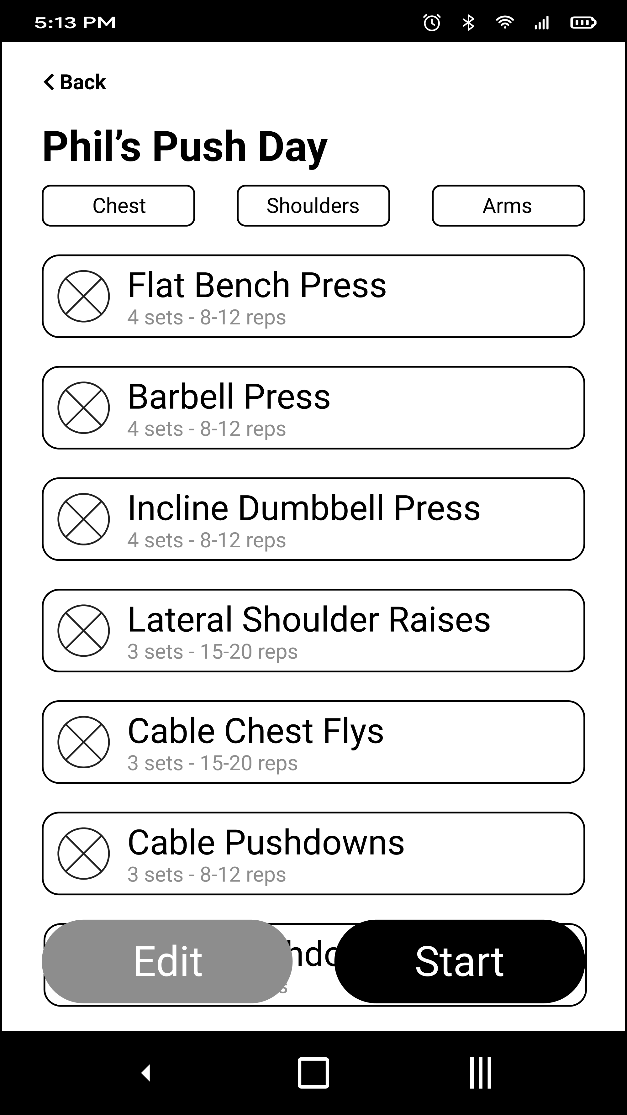
Once I had the initial sketches, I moved on to creating wireframes in Figma. These helped provide a deeper understanding of the red routes and enhance the details of each individual screen that would be needed.
When designing the homepage, it was important to visualize the activity feed because the community is a large focus of the design.
When designing the screens during a workout, it was important to include an instructional video and exercise information while still being clean and minimalistic.
High-Fidelity Prototypes
Using Figma, I enhanced the wireframes while using and updating my style guide and turned each red route into its own prototype. I started with the colors blue, light blue, and gray, but I found them to be too boring and corporate so I switched to a more electric orange with black and white to complement. This brought more energy to the design.
evolution of the home screen
Here you can see the evolution of the home screen including some changes after later user testing. It all came down to what information I wanted to include in each post’s card on the activity feed. I adjusted the color scheme from blue/light blue/grey to orange/black/white. I also finished with a flat, simplistic design after flirting with some 3D elements and drop shadows. In addition, increased the size of the white card to add more white space and give the elements some more breathing room.
evolution of the custom workout
Here you can see the evolution of the custom workout screen. I ended up separating the individual exercise screen from the total workout screen. This screen was less cluttered when customizing the number of sets and reps while also including an instruction video for the exercise. The finalized workout screen has the ability to add/delete exercises and even add additional workout days.
evolution of the onboarding screens
Here you can see the evolution of the initial onboarding screen. These changes came after prototyping, user testing and witnessing every user skipping past this screen that was just a boring wall of text. So I changed it to three separate screens with images and less text so that users would interact with and swipe through each page.
Step 5: Validation and feedback
Usability Testing Round 1
I invited five participants to conduct this test using Moderated Remote User Testing (MRUT) due to cross country and time-zone differences. MRUT also allowed the users to perform the test in a comfortable environment for a better result. I sent out a link to the Figma prototypes and gave each user 4 tasks they needed to complete.
1. You just downloaded a workout app, create an account and enter the app.
2. You just got to the gym, start a workout created for you by the app.
3. Create your own workout.
4. Check your past workouts and compare yourself to your friends.
Before the test, I asked users to think out loud about everything that crossed their minds during the test. I took notes on user’s every move on the screen, on everything they said and on every facial expression they made throughout the test. This allowed me to understand what the users were thinking and their frustrations during the entire process. I also asked for general feedback at the end based on the visual design and brand.
Usability Test Results 1
This first round of testing uncovered several bugs and missing features that needed to be added to ensure a better user experience.
Needed to add a delete button for sets and exercises when making a custom workout.
Needed to improve the initial onboarding screen because every user just skipped past the first wall of text.
Needed to improve the gender selection screen during the onboarding process.
Needed to add a built-in back button.
Needed to change the design to be flat and simple rather than 3D with drop shadows.
Usability Testing Round 2
I invited five new participants to conduct this second test with the same exact format as the first test after making iterations on my designs.
Usability Test Results 2
This second round of testing proved that we had solved all the bugs that were found in the first round of testing. Users were able to get through each task seamlessly and their suggestions were related to adding more features rather than fixing things that were broken or confusing. For example:
Potentially add a leaderboard to the home page.
Add an info button to explain points & milestones.
Maybe add some diversity in the onboarding images.
Add weight recommendations while in a workout.
Business Results
90% of users said they would use Uplift over other available workout apps.
70% of users found Uplift was easier to create a custom workout than other top competitors.
60% of users said they feel more motivated to go to the gym when using Uplift.
Knowing what you know now, what might you go back and do differently?
Most of this project was done remotely since I did the work on my own. Because of this, face-to-face human emotion was missing in the user research stage. I would have preferred to conduct the user interviews and testing in-person so I could have felt the user’s positive and negative feedback.
The one thing I would surely redo is the sketching process. I focused on little details too much which slowed me down and didn’t let me flow through the design naturally. As I continue to work on future projects and get more comfortable sketching, I am sure it will come more naturally to me.
The use of user-centered design processes gave me the ability to discover the motives, emotions, and needs of the target audiences. The research helped me understand that the users want to have a community to workout with and to motivate each other to achieve their goals and have fun while doing it.


